

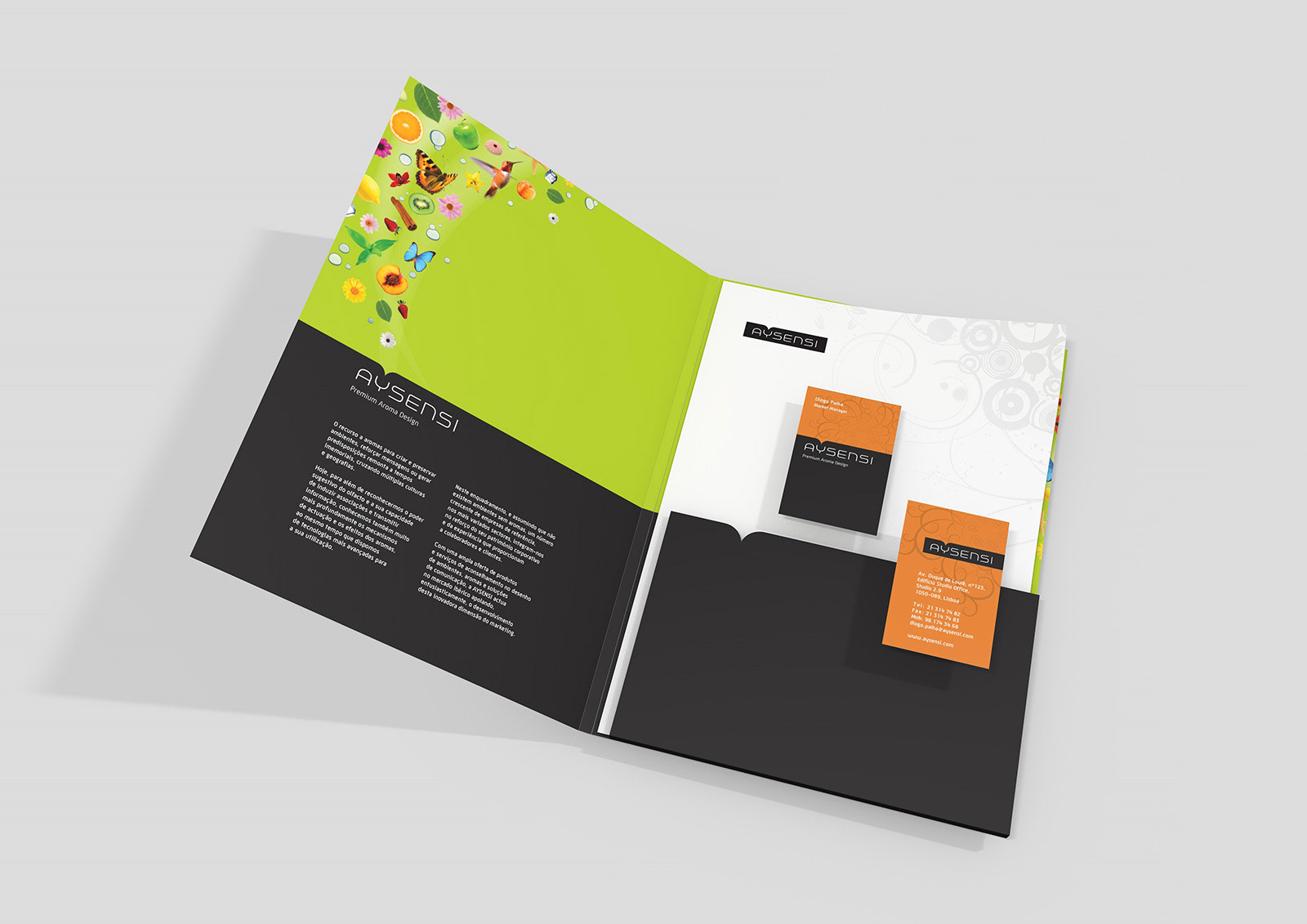
The visual identity was constructed from the idea of an 'opening in a box', from which the aromas come alive. The 'hole' above the 'Y' letter convey that idea, and it serves as the origin from where all the visual elements are 'released'. The black color relates to the ScentCube equipment and provides a neutral basis for the strong colours and the images that complement the visual identity.
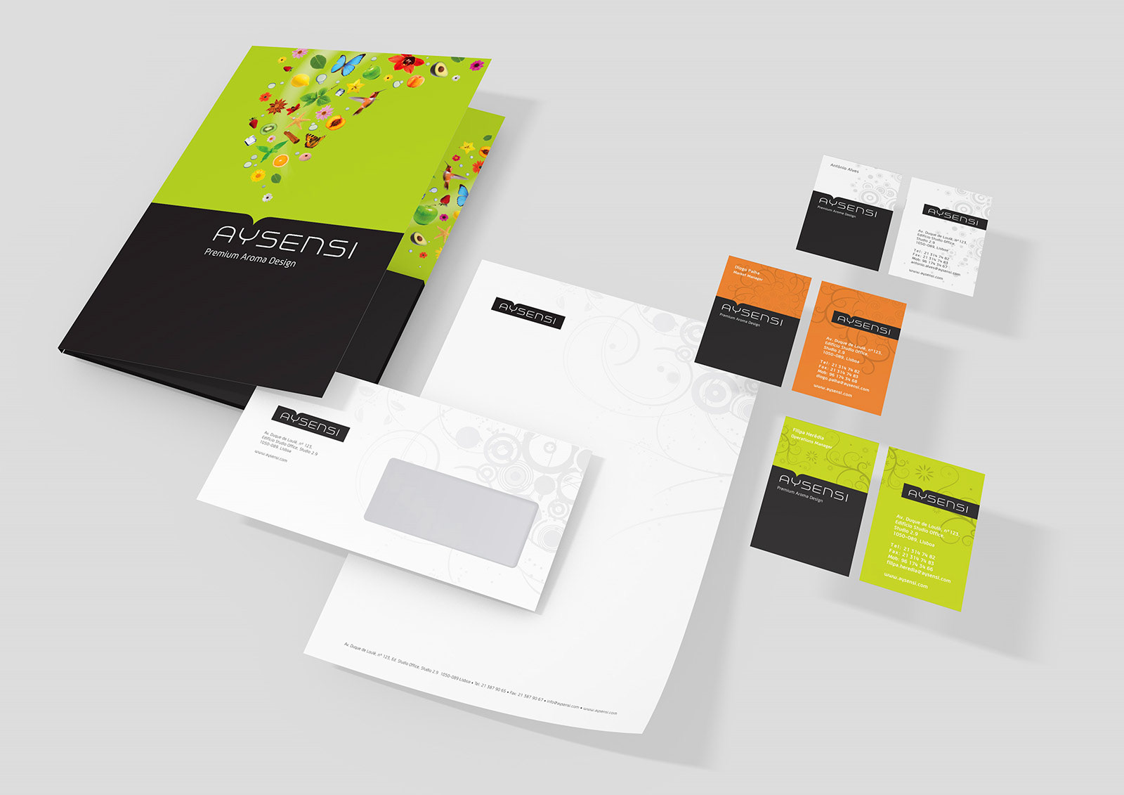
To express the diversity of aromas present in the company's portfolio, the logo is complemented with images of fruits, flowers, birds, butterflies, etc. In the stationary, the decorative elements are applied using only localised UV varnish, expressing the idea of an aroma, something that is detectable but not visible.
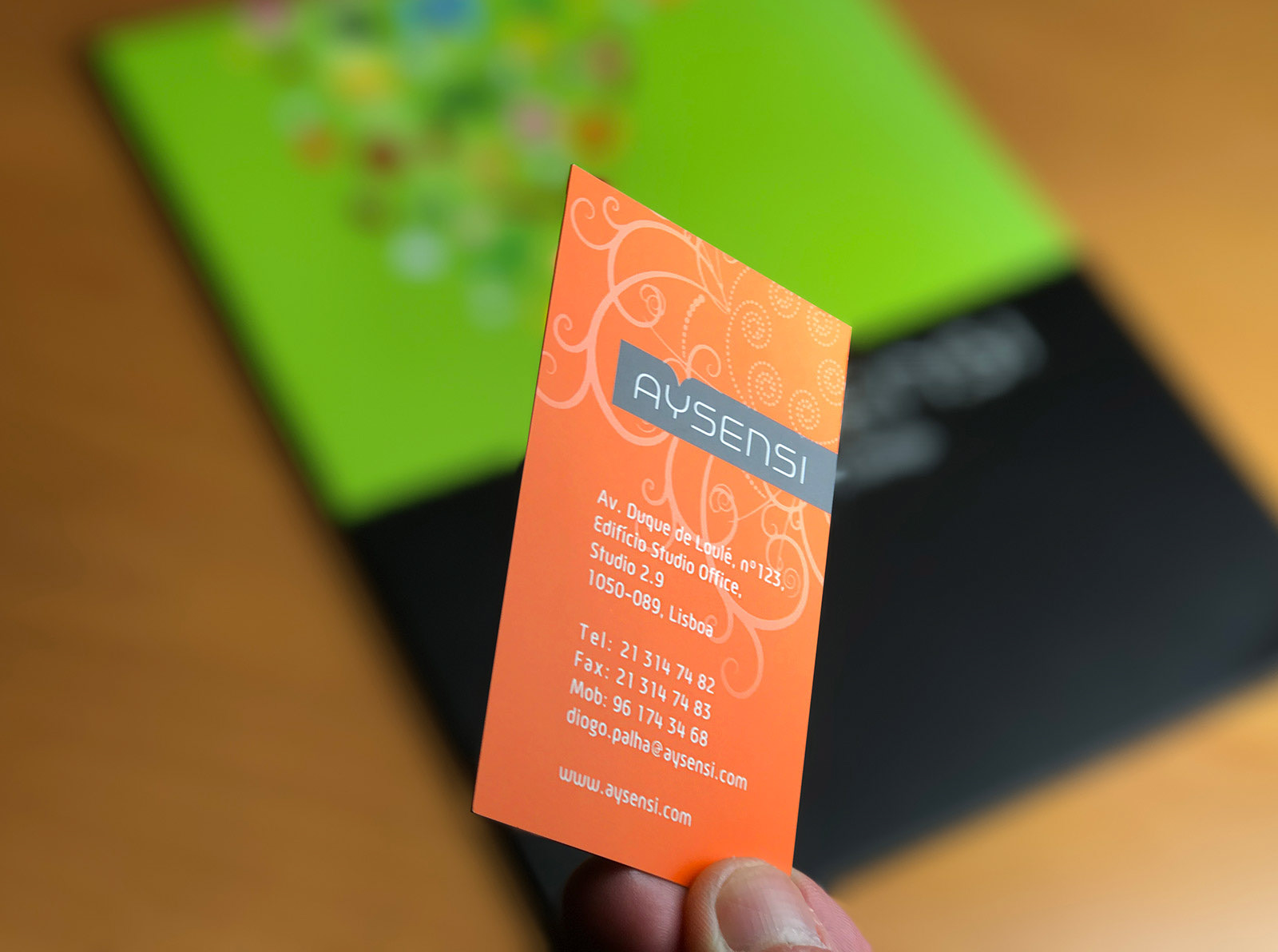
Stationary detail
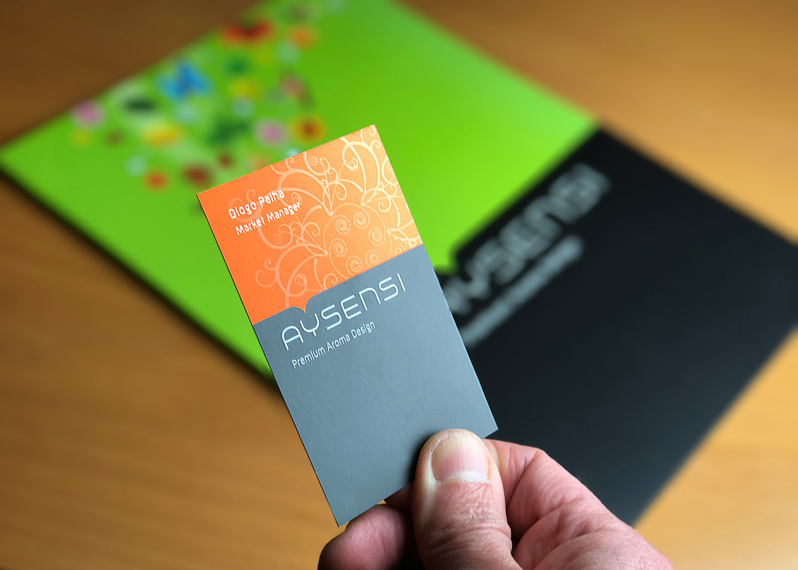
Stationary detail

Stationary detail
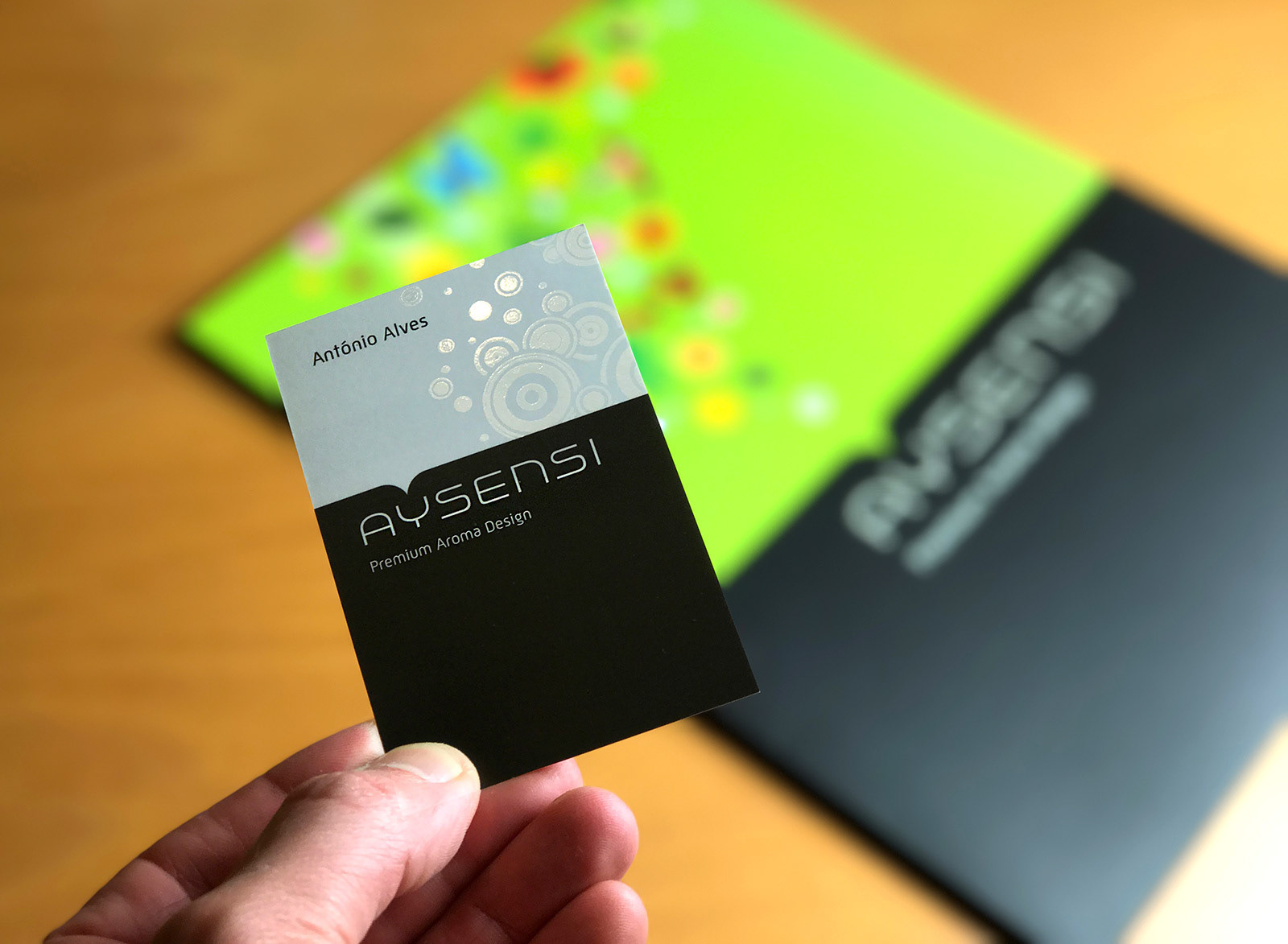
Stationary detail

Folder

Folder
Folder
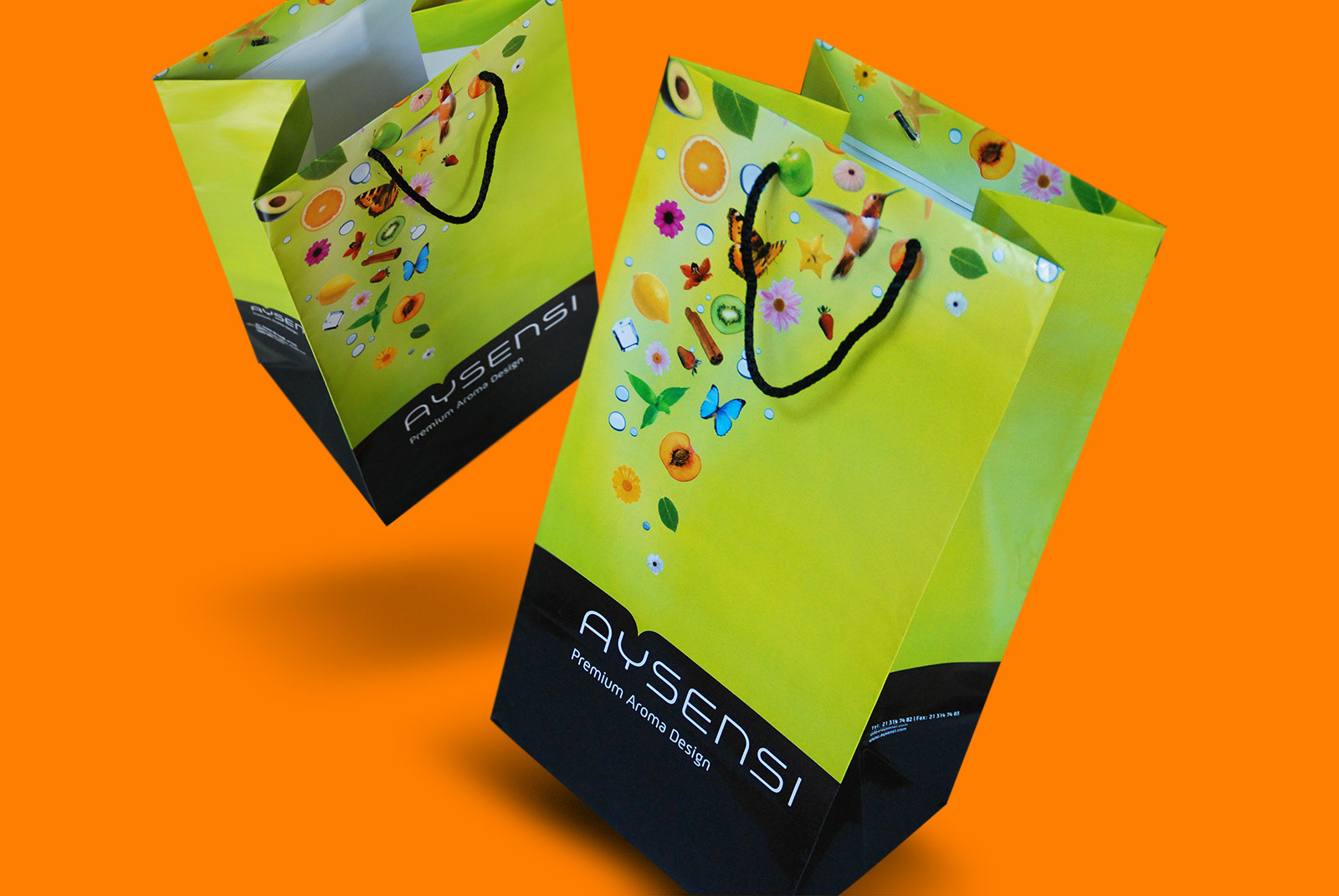
Paper bags

Display module

Display module

Display module